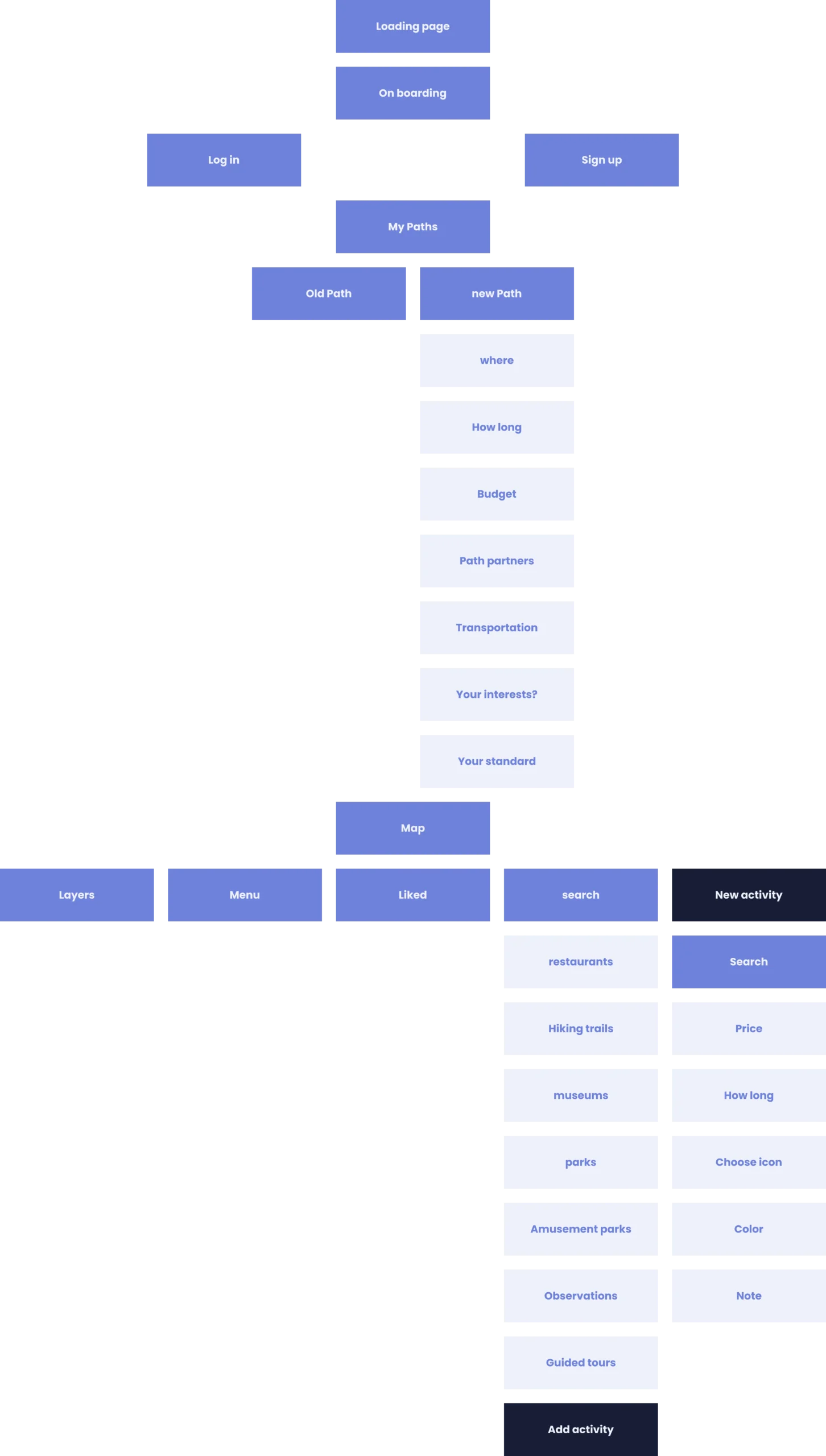
Showcase – UX/UI

Personal Expenses Dashboard

Background

Planning a trip can be one of the most exciting parts of travel — but also the most chaotic. From scattered Google Maps pins to random screenshots and dozens of tabs open, travelers often find themselves lost in the logistics instead of inspired by the journey.

Path was created to give users a single, visual, intuitive space to plan trips, mark destinations, and build personal routes with meaning and clarity.

Goals

  • Create a centralized and visual environment for trip planning
  • Enable intuitive discovery and saving of places
  • Let users personalize their maps with icons, layers, and notes
  • Reduce the cognitive load during planning
  • Allow collaborative and flexible travel path creation

The Problem It Solves

People use too many disconnected tools to plan trips — maps, notes, social media, and memory. These scattered inputs lead to frustration, missed spots, and messy itineraries.
There’s a need for one beautiful, organized space to collect, tag, filter, and revisit travel ideas — both for solo travelers and groups.

The Personal Impact

As someone who travels frequently and loves organizing every detail, I often found myself overwhelmed by cluttered browser bookmarks, half-baked Google Maps, and vague notes.
Path was born from this frustration. I wanted a tool that felt more like a travel journal and less like a spreadsheet — one that makes planning part of the joy of the journey.

Research

Methods Used:

  • Informal user interviews with 10 travelers of varying travel styles

  • Behavioral mapping of existing workflows using tools like Google Maps and Notion

  • Survey shared in travel-related online groups (n=54 responses)

  • Competitive benchmarking of leading apps

Goals of Research

  • Understand how people currently plan and organize travel

  • Identify the most common frustrations in the process

  • Learn what features would make people trust and enjoy a planning tool

  • Explore how different types of travelers prioritize information

Competitive Research

In order to understand the landscape, I explored several popular tools that people currently use to plan their trips — such as Google Maps, Notion, and TripIt. Each offers helpful features, but also leaves significant gaps for the kind of experience Path aims to deliver.

  • Google Maps is reliable, widely used, and great for navigation. However, it lacks personalization options like custom layers, icons, or meaningful notes. It also doesn’t support organizing places into thematic routes.

  • Notion is extremely flexible and useful for lists, budgets, and notes, but doesn’t offer a spatial or visual interface — which makes it hard to get a feel for the flow of the trip.

  • TripIt is strong when it comes to managing confirmations, flights, and logistics — but doesn’t offer features for exploration or inspiration.

The conclusion? Most people are forced to combine several tools just to plan one trip. Path brings these pieces together into one cohesive, visual, and flexible experience.

Customer Quotes and Unmet Needs

“I use a Google Sheet, Instagram saves, and a custom map. It’s a mess.”

“I wish I could just tap on a map, color-code the place, and leave a note.”

“I want to build my dream route for Japan, even if it’s 6 months from now.”

Key unmet needs:

  • Visual, intuitive trip building

  • Easy annotation and prioritization

  • The ability to “see” the journey, not just list it

Personas

Tamar – The Organized Explorer

Age: 34

Occupation: Interior Designer

Trip Goal: Plan a detailed two-week trip to Italy with her partner

Pain Points: Tamar juggles maps, notes, and screenshots across different tools. She struggles to visualize locations and fears missing out on great spots she saved months ago.

Amir – The Spontaneous Backpacker

Age: 24

Occupation: Freelance photographer

Trip Goal: Create a loosely structured backpacking route across South America

Pain Points:

Amir dislikes rigid planning tools. He needs a way to casually organize ideas without losing them, and to prioritize spots without overwhelming structure.

Dana – The Family Planner

Age: 40

Occupation: HR director

Trip Goal: Organize a family vacation with kids across several European cities

Pain Points: Dana handles the entire plan alone. She needs quick access to saved places, better communication with her spouse, and a tool that works well on the go.

Persona Insights and Conclusions

Across all three personas, several shared themes emerged:

  • A desire to combine inspiration with logistics

  • A need for visual organization, not just lists

  • Frustration with planning tools that are either too rigid or too open-ended

  • The emotional aspect of planning: excitement, anticipation, and personal meaning

These insights shaped Path’s features: layered maps, flexible path creation, and the ability to add context through color, icons, and notes.

Dashboard Flow

Final UX

Branding

Colors

Primary colors

889BF5

171D36

EEF1FC

Secondary colors

Gradient

6E81D9

FFFFFF

Font

Poppins Light - 24 H1

Poppins Light - 18 H2

poppins Bold - 14 H3

Poppins Light - 12 H4

Poppins Medium - 20 button

Final UI